
Developing mobile content
This feature is only available for Custom CMS website clients!
Did you know that your custom content-managed website came automatically with a mobile-friendly website? Navigate to your website on your smartphone to see it. If you go there, and all you see is your site header image and a button that says "View Full Website," then you have some work to do!
What are my clients looking for when they search for my website on their smartphone?
Generally, they are only looking for the very basics - who, what, where, when and how. You really only want to develop a few pages for your mobile website. Typical pages would be 'About Us,' 'Our Services,' and 'Contact/Find Us,' depending on the nature of your business.
How do I add mobile pages to my custom website?
Most custom CMS sites have the following four buttons at the top of the main management screen:

The 'Define New' and the 'Show Deleted' buttons are explained elsewhere. The 'Home Rotation' button will only be there if you have a rotation of images setup across the top of your website's home page.
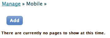 To add mobile web pages to your custom website, go ahead and click the 'Mobile Pages' button in your own website's management screens, as shown above. If you see what's on the right here, then you need to add some pages to your mobile website.
Go ahead and click the 'Add' button on your website to do that.
Now you should see the screen partially displayed below:
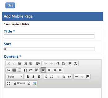
There are no 'Define' screens for the mobile pages. Everything is contained on this one screen for each page. The Title you input here will be the header on your mobile page and it will also be your title at the top of the mobile browser.
The Sort Order will sort the buttons on your mobile website's home page.
The Content box has the same editor window that you have on your full website pages, with all the same buttons in your toolbar.
Copy some of the content, or summarize some of the content from your full website pages into your new mobile pages. Just keep in mind that if you copy the content, and you want to change it later, you will need to update both your full website page AND your mobile page for that content. They are two separate pages on your site.
Adding images - When you add images to your mobile web pages, keep in mind that the screen area is small. It is important that you size your images by percentage of width instead of fixed width sizes.
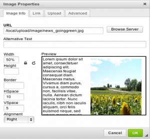 See the example on the right here of an image set to 50% in the width field. Remove anything from the height field so it will default proportionately to the width.
In this case, we are aligning the image to the right of the text and putting 10 pixels of padding horizontally, and 5 pixels of padding vertically.
Now the image will fill up 50% of the available space, no matter what size the mobile window is. This will prevent your website from getting blown out to the left or the right, and forcing viewers to scroll their window sideways to see the full image.
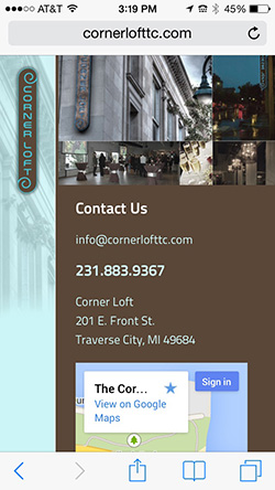
Adding your contact information - there are some nice features that you can add to your Contact Us mobile page.
For instance, if you put your email address there and add an email link to it, when someone touches that email address on your mobile site, it will automatically open up their email program with an email addressed to you started within it.
Then if you type your phone number on your mobile page and someone touches that there, a little popup will appear on their screen asking if they want to dial that number.
Lastly, if you type your address on your contact Us page, and add a Google or Bing or Mapquest map link to it, and someone touches that link on your mobile web page, they will be directed to another web page with your location mapped right on it.
Notice on the example mobile page on the left that we also embedded a Google map right on the page below the address link. A typical embedded map size on a mobile page might be 200 pixels wide by 300 pixels tall.
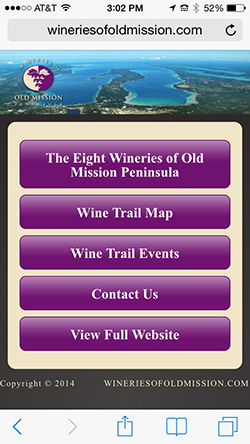
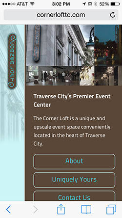
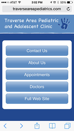
Example mobile websites
View these sample mobile websites on your smartphone:
 |
 |
 |